5 Common Problems with Enterprise Reporting

To get ahead in your industry, you need an agile business that can react quickly. Key decision-makers need reliable business insights delivered to them efficiently and effectively. Companies usually achieve this via enterprise reporting and cooperation between business and data analysts and decision-makers
However, if these reports don’t provide consistent information, adequate context, and reasoning, it can lead to severe problems. People may dismiss valuable information as irrelevant, built from bad sources, with poor quality data, or not offering any real value to the organization. At its worst, bad reporting can make people question the integrity of the organization’s data as a whole.
Here are some common problems to avoid when building an enterprise reporting strategy.
#1 Not having a coherent reporting strategy
Companies have their data spread through several sources, locations, and ERPs. With all this variety, having a well-defined reporting strategy is the only way to keep information consistent, especially if the technology used for each source also differs. Despite that, some companies will still rely on a “play it by ear” approach, creating reports on-demand with the tools they have available.
Without a strategy, your organization’s reports will be a chaotic free-for-all where data users can submit whatever they like. Beyond the disorganization, it gives your users and report generators more information to comb through (with no clear idea of what is relevant, what has been included in previous reports, what’s the structure and convention, and no easy navigation through the report), lengthening the entire process.
The result of an incoherent reporting strategy is:
- Users cannot find the answers they need in a mass of empirical reports.
- Communications slow down or even stop.
- Reports take longer to build and become harder to repeat.
- People mistrust reports or do not know which ones contain the most up-to-date information.
- Reports are hard or impossible to compare with each other.
- Missing integrity in reporting, with each chart showing the same data differently.
- People coming to different conclusions from the same report.
- People miss the big picture or the most crucial point of the report.
The first and foremost step to enterprise reporting is having a coherent and repeatable reporting strategy. Your strategy should contain protocols like:
- Data Formatting and KPIs. Having a standard definition of data across the enterprise while keeping track of key performance indicators (what you need to report on) will keep your reports relevant and uniform.
- Standardized data glossary and understanding. Having a shared understanding of what data and terms mean helps bridge the differences in perspective on the same data from different people.
- Systems and tools. Your tools should be self-service for employees to create near-real-time data visualizations and snapshots from their data sources. Having one that automates this process will help standardize formatting and other stylistic elements.
- People and organization. Prioritize reports that link source data to the goals of the company.
- Reporting governance. Manage reporting and data access by defining rules and responsibilities of various data users for standard reporting, raw data, etc.
- Report catalog: Metadata management for tracking reports. I.e., making sure people don’t create the same reports twice.
#2 Not having unified data
Spending time to unify your data and make it fit for use is one of the best ways to standardize your reporting. Since data sources are diverse, the data structure, format, and potentially even definition will differ. This results in users often working with data in a different “shape” (held in tables with different names, labels, columns, and structures) or other variables like coding schemes, product names, and currencies.


For example, above, the sales are in dollars while the other is in Yen. This changes the graph values and makes them incomparable without extra effort.
Users won’t know which final format it needs to be in to make it consumable and comparable with the rest of the organization (no universal reporting structure, labeling, currency, etc.).Left unchecked, this variation can result in entirely different conclusions from the same source data.
Enabling data standardization and cleansing directly in the UI without the need to code will ensure report uniformity. This will:
- Give all users confidence that the data they are working with is reliable.
- Make reports easier to compare and interpret.
- Avoid putting the enormous responsibility of recreating every report on the BI/analyst team.
- Decrease time to insight and improve business efficiency
#3 Not having high-quality data
Just because your data is unified doesn’t mean it’s high quality. You need to monitor for any inconsistencies in the data, such as changes in data structure or sudden drops in data volume. Otherwise, you won’t be able to paint an accurate picture of whatever you are trying to understand/report on because a single problematic/incorrect chunk of data could omit the entirety of your analysis.
It’s also about being able to get insights and reports in a timely manner. In this case, you need to resolve issues in your data quickly (because issues will inevitably occur) so you can get back to using it for its intended purpose as soon as possible. With integrated workflows, data quality tools, and dedicated data owners, you can resolve issues more effectively and prevent them from causing real damage. Moreover, you’ll need to make sure you have means of preventing issues from happening in the future by writing data quality rules, setting up data quality monitoring, and using advanced technologies like data observability or a data quality firewall.

#4 Slide decks require a lot of copy & pasting
Many companies use presentation software like PowerPoint or Google Slides for their reporting. These tools allow you to present enterprise reports created in BI tools on a slide-by-slide basis with the ability to add textual explanations, graphics, and annotations.
However, while these tools are excellent for unveiling information gradually, using them for enterprise reporting is often inefficient. Let’s take a closer look.
Too much copy & pasting and switching between tools
These tools can be time-consuming because they don’t connect directly to your data sources. You will have to upload the source data into a chart or visualization creator (or take manual screenshots of the dashboard), leading to a lot of copy and pasting and clicking back and forth between tools. There’s more possibility for human error (missing a data point, adding the same data point twice) during this transfer of information from one tool to another.
Slide decks don’t update automatically. Every month (or however often these reports are due), you must recopy and repaste all the new information back into your slide deck. This is why consistent slide decks take so long to recreate, even with a template.
#5 Reports aren’t designed for independent consumption
Many organizations make the mistake of thinking a report presented with a narrator can be just as easily understood without one. Once the report has been delivered, a version with the narrator’s notes or annotations is usually uploaded onto the cloud. They expect all users to catch themselves up from there.
However, reports presented by a narrator will typically display only some of the relevant information, allowing some space for the narrator to fill in the gaps and connect the dots. Unless the annotations perfectly capture the narrator’s mind, at least some information will likely get lost or miscommunicated along the way.
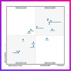
Below you’ll see an example of how hard it is to interpret a graph without any narrator or additional explanation

You should keep this in mind for your enterprise reporting because it will always have to be consumed independently at some point. Every interested party or stakeholder can’t be at every meeting. People often want to look back at presentations as a resource or compare them with a more recent version. When they do, you don’t want them to be confused or miss a critical insight.
Reports lack textual explanations
Text explainers that link the visuals and guide the audience through the narrative are imperative. This will help the audience can move through the information at their own pace without missing the main point or failing to connect the dots.

Tips for creating narrator-less reports
If you’d like to learn more about storytelling with data, you can read our article here. By keeping in mind that audiences will be consuming your reports independently, you can add features and elements which allow users to understand them better:
- Interactive drill-downs for viewers to extract exact values from charts
- Add links to particular data sets for people who want to look at the source data.
- Add textual explainers between charts to reference how they are connected and drive the narrative forward (data stories can generate these automatically with AI).
- Highlight significant changes with different colors or symbols, providing a legend next to the chart to explain their meaning.
- Use the title of your charts to emphasize their main conclusion or takeaway (instead of just naming them after the variables they’re depicting)
- Present information in an organized and particular order that moves chronologically through your narrative: Thesis > Evidence > Conclusion (not just individually isolated charts with lots of notes under them).
Simplify your reporting workflow
If you’d like to avoid all these problems, start by ensuring the quality of your data. This will increase consistency and trust, which will trickle down into your report creation and strategy. Then make sure that data is easily accessible and consumable by any user who needs to work with it (while still maintaining consistent control over access permissions). People will be more willing to use the data, increasing the number of people who can contribute to improving your enterprise reporting as a whole.
After that, you can choose your favorite BI tool and work from there (while keeping in mind the tips we mentioned about). Want to know how to achieve the ideal trust, consistency, and quality of data? Talk to us.