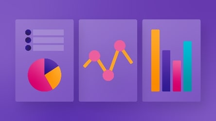
Why Pie Charts are Evil

Pie charts were probably the second or third graph type your math teacher introduced to you right after bar graphs and line charts. Maybe they even forced a protractor into your hand so you could get all the angles and percent ratios correct.
Today, pie, donut, and gauge charts have been exiled from the data analytics and visualization community. Data experts rave about how they are “inadequate,” “bad,” or even “evil.” But why do pie charts have such a bad reputation these days? Let’s find out.
1. Pie charts take up too much space
Whenever visualizing data, you have limited space to work with. Either in the confines of a PowerPoint slide or as one step in your data story, you have to treat that precious digital real estate with care and fill it with the most value for the viewer/reader.
One major problem with pie charts (including donut and gauge charts) is that they use more space than alternatives that provide the same value (e.g., a bar chart). This is due to two reasons: the nature of their shape and how they depict information.
- Pie, Donut, and Gauge charts use area to give value to a single category, whereas bar charts just use distance.
- These charts are circular, which creates unnecessary space around the chart object.
A simple bar chart, by contrast, uses distance along a single axis. It fits neatly into tight spaces and delivers faster visual clarity.
2. Pie charts aren’t as readable as other chart types
Graphs are useful when a picture of the data makes meaningful relationships visible (patterns, trends, and exceptions) that could not be easily discerned from a table of the same data.
One of the biggest issues with misleading pie charts is how difficult they are to interpret at a glance. This is because the human eye and mind are much better at comparing distance instead of area. After all, you only have to assess one dimension instead of two.
For example, if I asked you, “How much bigger is ‘Pinot Grigio’ than ‘Tempranillo’ on the chart below, it would be challenging to give an exact answer.

However, with a bar chart, you might have an easier time finding your answer: ‘Pinot Grigio’ is about 3X larger than ‘Tempranillo.’

Angle perception is another problem with bad pie charts. It’s easier for people to judge the magnitude of a slice when it has nice round 90° angles like 0, 25, 50, 75, and 100%. However, humans can’t easily perceive the differences in angles that fall outside those numbers, and, with no scale, it becomes even more problematic.
We often overestimate obtuse angles and underestimate acute ones. Even when you have easy-to-read values (like 90°, 180°, 360°), something as simple as rotating the chart can still throw off your perception.

As you add more segments, this problem gets worse. Pie charts also have problems fitting labels on the graph when there are too many variables, forcing the use of legends and wasting the viewer’s time switching their eyes back and forth between the legend and the chart. When the slices get too small, people like to add labels and numeric values to each slice. However, if you’re adding in names and numbers, you might as well be looking at a table.
In modern dashboards, interactive elements like hover data, tooltips, and color-coded bars offer cleaner, more user-friendly ways to explore comparisons without adding confusion.


3. Why bad pie chart examples fail with complex data
Pie charts don’t allow as wide a range of options for additional data points as bar charts and other types. There are several ways to enrich bar charts with additional data points that don’t make the graph look too crowded or hard to read. You can see this in the bullet chart below, which adds additional values to display targets and ranges.

However, adding these elements to a pie chart makes it harder to read. The same can be said for 3D renders of pie charts that don’t add additional information.
Instead, they will just add complexity and require you to take another dimension into consideration. They will also distort the images, as whichever slice is farther away will look smaller.


Best Alternatives to Pie Charts
In 90% of cases, you can use bar charts instead of pies. They can display almost any information a pie chart can, and they’re easier to read.
The only question is, “What type of bar chart should you use?” Remember that no matter what kind of chart you choose, your decision should be based on:
- Your use case
- The data you want to chart
- The space you have available
Many assume pie charts are ideal for percentages. In reality, data visualizations in bar charts are still easier to read because they rely on a single axis. If space is tight and you are only comparing a few categories, a stacked bar chart might be a better fit.

On the other hand, a classic bar chart is an excellent choice when you have a lot of values and want your viewers to make a comparison quickly.

Some people choose pie charts just to add variety to their presentations. However, using the correct tooling is far more important. For data visualization, the proper tooling is always whatever is easiest to read and interpret. Better to be understandable than exciting. If anything, having the same type of charts makes your reporting more consistent.
When is it appropriate to use a pie chart?
While pie charts are often criticized, there are situations where they still make sense. The key is to know when it is appropriate to use a pie chart, and keep the setup as simple as possible. One example is the use of gauges in cars.
Some reasons you might choose pie charts are:
- When there is only one slice of the pie, it’s easier to show its’ share of the whole value.
- You have a square (not rectangular) space for visualization
- Users are used to this chart from past visualizations
- It’s too complicated to display the information as a bar graph (e.g., analog measuring devices).
- Data is in %, and only two values are displayed.
- This allows the user to see data and percentages, and they can quickly reference the dimensions based on 50%
Good pie chart practices to keep in mind
If you choose to use a pie chart, following clear guidelines helps reduce confusion. These good pie chart practices make your data easier to interpret and your visuals more consistent:
- Order sections from smallest to largest, starting at the 12 o’clock position
- Don’t have more than five sections
- Don’t use them to display change over time
- Don’t compare pie charts to one another
- Ensure high data quality before building the chart
For better clarity, consistency, and scalability, use tools designed to support effective visualization. Ataccama’s platform helps teams go beyond basic charts with smart, adaptive visuals that align with the data story.
Data visualization is more than just charts
Charts are an excellent means for communicating the message behind your data. By understanding the different types and when to use them, you can build compelling visualizations that always get your point across.
If your teams rely on data to guide decisions, your visual choices matter. Focus on clarity, consistency, and context. That is what turns charts into real communication.

