We're back with another edition of Ataccama Innovate. This year our special focus is on data visualization and data storytelling!
We love helping our customers implement world-class data governance programs. We also want to give data leaders a new superpower. Besides smart, automated technology, data people need an effective and easy way to communicate the progress and success of what they are building.
Ataccama ONE has already been a unique offering on the market as it unifies data catalog, data profiling, data governance, data quality management, master data management, and data integration. Now we are stepping into the data visualization world with our new product: Data Stories.
"The value proposition of the data fabric is pretty simple: To provide high-quality data to the value creators across the organization, be it machines or people, in an easy and seamless way. Ataccama ONE is a unique offering on the market, unifying the following functionalities: data profiling, data catalog, data governance, data quality management, master data management, and data integration."
Michal Klaus, CEO, Ataccama
Michal Klaus, CEO of Ataccama, kicked off the Innovate 2022 event with a message of peace, imploring all viewers to offer whatever help they can to Ukraine and Ukrainians.
Ataccama had an amazing year in 2021. Michal wanted to congratulate everyone, noting that we doubled the number of new customers, almost doubled revenue, and added more than 160 new colleagues.
See Michal’s full intro to Innovate 2022 below.
Data Visualization: An Expert’s Advice
Good data visualizations happen when communication, the science of data, and design collide. When approached correctly, data visualizations provide critical insights into complicated data sets in a meaningful and intuitive way.
We invited John Burn-Murdoch, Chief Data Reporter at the Financial Times, to tell us how to do data visualization right. He is a thought leader in presenting data as a story and making data visualizations more engaging. Below is a summary of his most valuable data visualization tips.
"People really consume charts like they’re watching a movie or television... They’re not focusing on individual details as much as the overall message that a chart delivers."
John Burn-Murdoch, Chief Data Reporter at the Financial Times
Tips for data visualization
- Present your data as a story with a narrative, don’t just deliver individually isolated charts.
- Text is one of the first places people’s attention goes and can be used to get your chart’s point across immediately.
- Chart titles should reflect the purpose of the chart instead of what it’s depicting (the subject of the chart can go in the subheader).
- In most cases, the best place to start a data story is with a question.
- Gradually building up your point (and adding elements to the chart) is better than presenting a bunch of overwhelming information all at once.
- You should always keep the audience you’re presenting to in mind before building a data visualization.
If you’d like to learn more from John about data visualization, check his full tutorial below, or read this blog we wrote: How to Tell Stories with Data
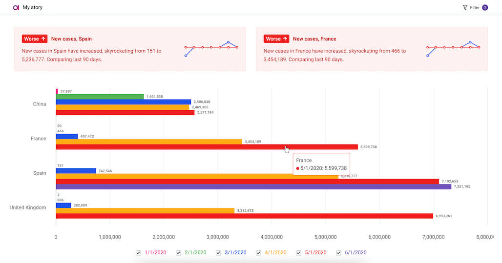
Presenting Data Stories
Data Stories can be an alternative to overwhelming and complex dashboards and BI solutions. Through an easier-to-understand interface, you can now present data visualizations to a broader audience without needing highly technical skills to produce them.
"Data Stories is our next-generation data visualization platform Data story is unique in our approach to presenting data. Oftentimes, we find ourselves overwhelmed by complex dashboards or overly complicated solutions. These tools are great at showing all sorts of information across a vast canvas. However, they require expertise to set up correctly, and they provide information in a format that can be hard to understand for a business consumer."
Michal Baumgartner, VP of Product for Data Stories, Ataccama
Data Stories also allows you to present your data in context with animations and automated “out-of-the-box” explanations. Instead of isolated charts and graphics, you can now plan a narrative around your data and its visualization. As Michal puts it: “Don’t just visualize your data, tell stories.”
"Data Stories provides clear visuals and have the ability to add context to the data with animations and an automated explanation of the data out of the box overall. This makes data easier to grasp for everyone - don’t just visualize data but tell stories."
Michal Baumgartner, VP of Product for Data Stories, Ataccama
Data Stories doesn’t aim to replace BI solutions, just to better serve users when rapid development or prototyping of simple reporting is needed.
You can learn more about the differences between BI tools and data stories, and the various use cases for data stories, in Michal’s explanation.
Telling Your Data Governance Story
Data Stories is part of Ataccama ONE, our data management platform, and we want you to use it to tell stories about your data projects. Case in point: data governance. Our VP of Product for Data Governance, David Kolinek, showed how you could use Data Stories to report about your PII compliance. You can report on the number of systems that contain personal data, types of systems and where they are deployed, retention policies, progress over time, and much more. What you can present to stakeholders is only limited by the metadata you’re storing in your data catalog.
"I hope this example helped you to understand how the Data Stories module can be used for presenting a compelling story and sharing the information in a way so anyone can clearly understand it."
David Kolinek, VP of Product for Data Governance, Ataccama
Taking Data Quality Reporting to the Next Level
Another great application of the data stories platform is using it for your data quality reporting. It connects directly to your data sources, making it easier to generate DQ status reports about your most interesting findings and communicate them to the rest of your company. From visualizing the state of data quality issues for specific projects and initiatives to creating always up-to-date overviews for your department heads, there are plenty of possibilities for DQ reporting with data stories.
Lenka Studničná, Data Quality Product Manager, shows what a data story about DQ would look like.
"Data Stories help you highlight the most interesting findings and communicate them to the rest of your company — from visualizing the state of the data quality issues for your tactical data remediation initiative meeting to create always up-to-date overviews for your department heads."
Lenka Studničná, Data Quality Product Manager, Ataccama
Effortless Sharing of Insights Built into Ataccama ONE
We got the chance to interview Jason Wright, Manager of Data Quality at T-Mobile, about where he sees the potential of data stories for his organization. He is excited about the convenience of data stories building BI into the Ataccama tool.
"You're having a builder of business intelligence that's built into the Ataccama tool. It would definitely be a one-stop-shop for us. We would prefer that rather than having to build something in a separate BI tool. I like the flexibility that you have in the tools so far the use of different widgets and business intelligence components, the organization of it, and the ability to get to things quickly. I see expanding the number of users that can actually get into the Ataccama data for data governance, so I think it's positive. I think this is a great direction for you to be heading to."
Jason Wright, Manager of Data Quality, T-Mobile
Hear exactly what Jason had to say in his full testimonial further below.
We also spoke to the team at Heineken about the potential they saw in Data Stories. They highlighted how it would make their reports more accessible and understandable to a wider audience:
“I have reports, I have data, but I want to communicate more vibrantly and in a more user-friendly way. By telling a story, we want to get close to the business and show them in a language they speak every day."
"Enabling the knowledge retention within the organization is very difficult. People come, people go, but when someone joins, and then he's taking over that particular department, and he looks at the report, he's not going to see the report the [same] way the guy who left and spent five years in the organization [saw it]. That's the missing part."
Ramesh Dusari, Insights Enablement, Heineken
Apparently, knowledge retention and sharing of insights are crucial for business operations at Heikenen. A truly digitally enabled organization!
“Getting insights becomes like a Facebook post within the organization. That's where I see the potential. If we give people an option to publish their insights and understanding, it doesn't need to be right or wrong, but it opens up a conversation to make our data more accurate day by day by looking at it.”
Our customers are clearly excited about Data Stories, and we can’t be happier for them to start using the tool on a daily basis.
MDM Reporting with Data Stories
Similar to Data Governance and Data Quality, Data Stories can also help you create reports about your Master Data Management Projects. Himani Pant, a Solutions Consultant at Ataccama, says that “[with data stories] reporting to your managers and decision-makers about important [MDM] metrics becomes effortless.”
You can easily make reports about how many records have been imported from each of the systems in your organization, which records are unique vs. duplicates, data quality information for source and master data, and much more. See Himani’s full MDM data story below.
The Vision for the Future of Ataccama ONE - and How Data Stories Fits into It
By now, you have had the opportunity to see how Data Stories already offers a plentitude of value to different users. However, this is not where it ends. Let’s see how Data Stories work in the context of Ataccama ONE and broader company-wide use by business users, data analysts, or anyone else interested in the data.
Martin Zahumenksy, our Chief Product Technology Officer, presented the Ataccama vision and the things you can expect to come to the Ataccama ONE platform in the future. He also shared a couple of examples to illustrate what Ataccama has in plan:
- Data stories available from our data catalog
- Easy-to-use data preparation
- Data authoring and publishing for reference data management use cases and beyond
It’s time to embrace data democratization!
"What’s coming in the future is the ability to share Data Stories back to catalog and attach them directly to selected catalog items. This is a very useful feature as the next time someone else in your company is looking for some insights on the same topic, they will see it both in the search and also on the selected catalog item giving them the business value they expect from catalog.The best part is that Data Stories are live, so they are not charts residing somewhere in Powerpoint, which you need to update again and again. They are simply always up to date, and our insights engine is able to provide readers with interesting information and new facts when things start to change."
Martin Zahumenksy, Chief Product Technology Officer at Ataccama
Data Stories: Completing the Data Fabric Experience
Ataccama’s vision for how to complete our data fabric experience and give more users more power to work with data. We are creating insights helping to make better decisions, and providing better data to different users' applications or machine learning models as part of your data fabric.
The vision is to enhance the catalog experience by building insights, widgets, and stories to allow users to work on their specific tasks in one space. Here, they can do everything from accessing data to manipulating it through the data prep. They can also watch the quality appending insights through our Data Stories, providing the data further and making all of this available in the catalog, so other people and teams can easily collaborate.
Making Data Accessible for Everyone
During Innovate 2022, we had the opportunity to see how Ataccama Data Stories provides value to different types of users. From our guest speakers, we’ve heard some of the fundamental do's and don'ts of visualizing data, what makes a data story compelling, and the role that end-users play in creating a visualization.
We've also seen concrete examples of what makes Ataccama data stories a next-generation tool and its value to your data governance, DQ, and MDM projects. In contrast, BI application dashboards can be overly complex or require an expert to set up correctly. Now let’s hear from Afshin Lotfi, CEO, Ataccama North America.
"Data Stories makes everything easier with clear visuals annotations that provide further context explainers and insights that are generated automatically dynamic cross filters and drill-downs and visualization that can be exported and easily shared online. It enhances your existing data governance, data quality, and MDM implementations with new visualization experiences for users and broadens your user base by allowing them to engage without a camera in a more visually accessible and collaborative way."
Afshin Lotfi, CEO, Ataccama North America
We're excited that Ataccama will be offering a freemium version of Data Stories — this means that you will be able to take advantage of data stories right away, whether you're a journalist, an NGO working with open data, or a data steward who's looking for a new modern way to visualize data stories for your management team, you can do it for free right now through the software service version of the tool hosted on datastories.adacama.com.
"Ataccama continues to lead the way in developing applications that are scalable, resilient, highly available, simple to operate, and easy to install."
Afshin Lotfi, CEO, Ataccama North America
Start telling stories with data today
Ataccama Data Stories are free.
10 public stories • 10 datasets • 10 million data rows